Great Western Park Marketing Suite.
Taylor Wimpey asked Phaeon to look at their marketing suite at Great Western Park. The existing design and layout was very busy and cluttered and they felt that the overall impression for their visitors was a very confusing one.
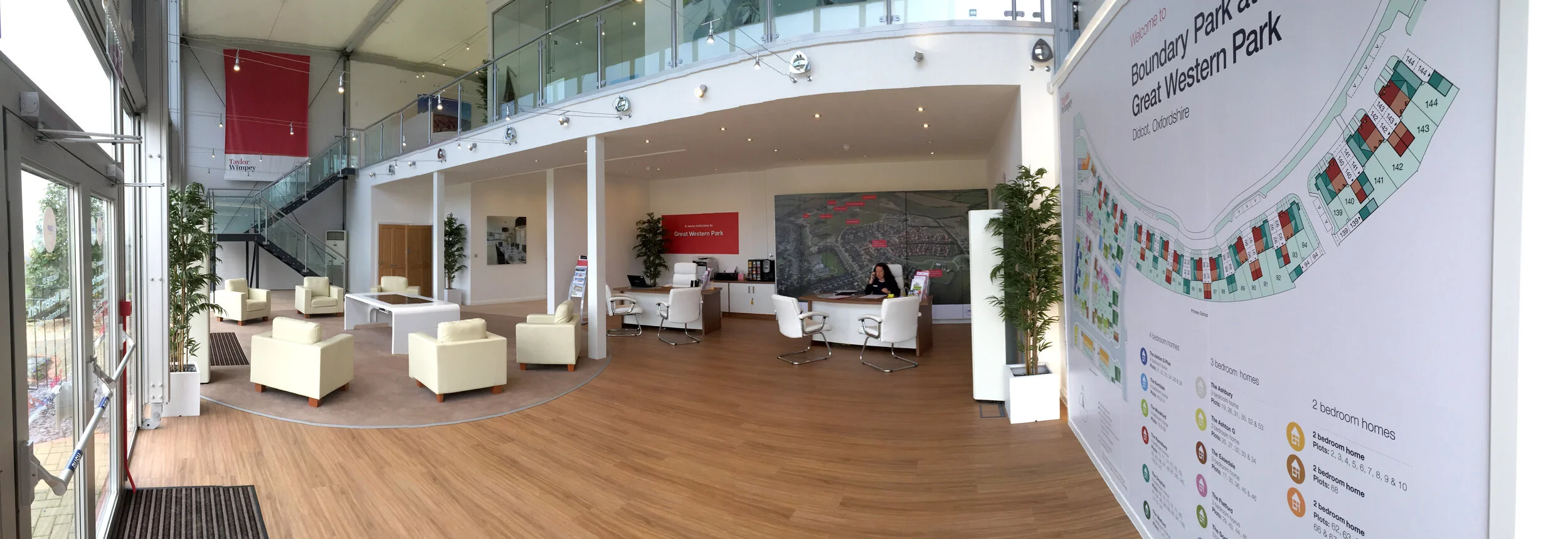
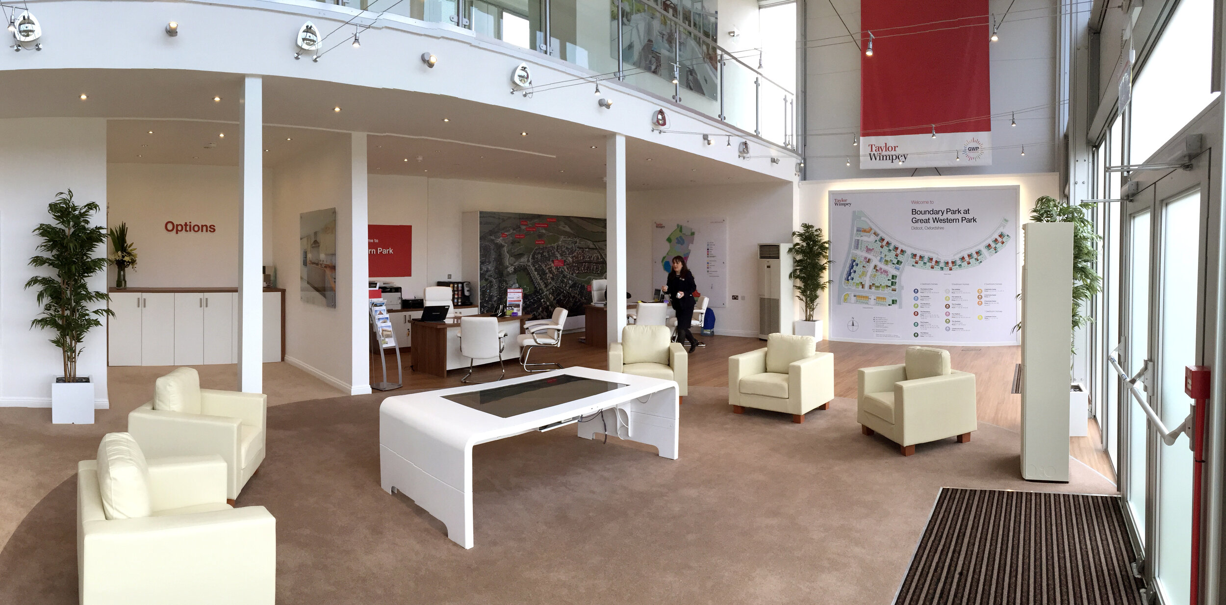
Phaeon opened up the space, created a comfortable and more private choices area up on the mezzanine and by clever use of a curved flooring design, combining oak and carpet, introduced zones so that the visitors new immediately how they should move through the space. The old boxed displays were removed and replaced with a new, touch screen, interactive table display.


Before
The floor space was very cluttered with a confusion of brightly coloured displays leaving the visitor unsure of where they should go on entering.
After
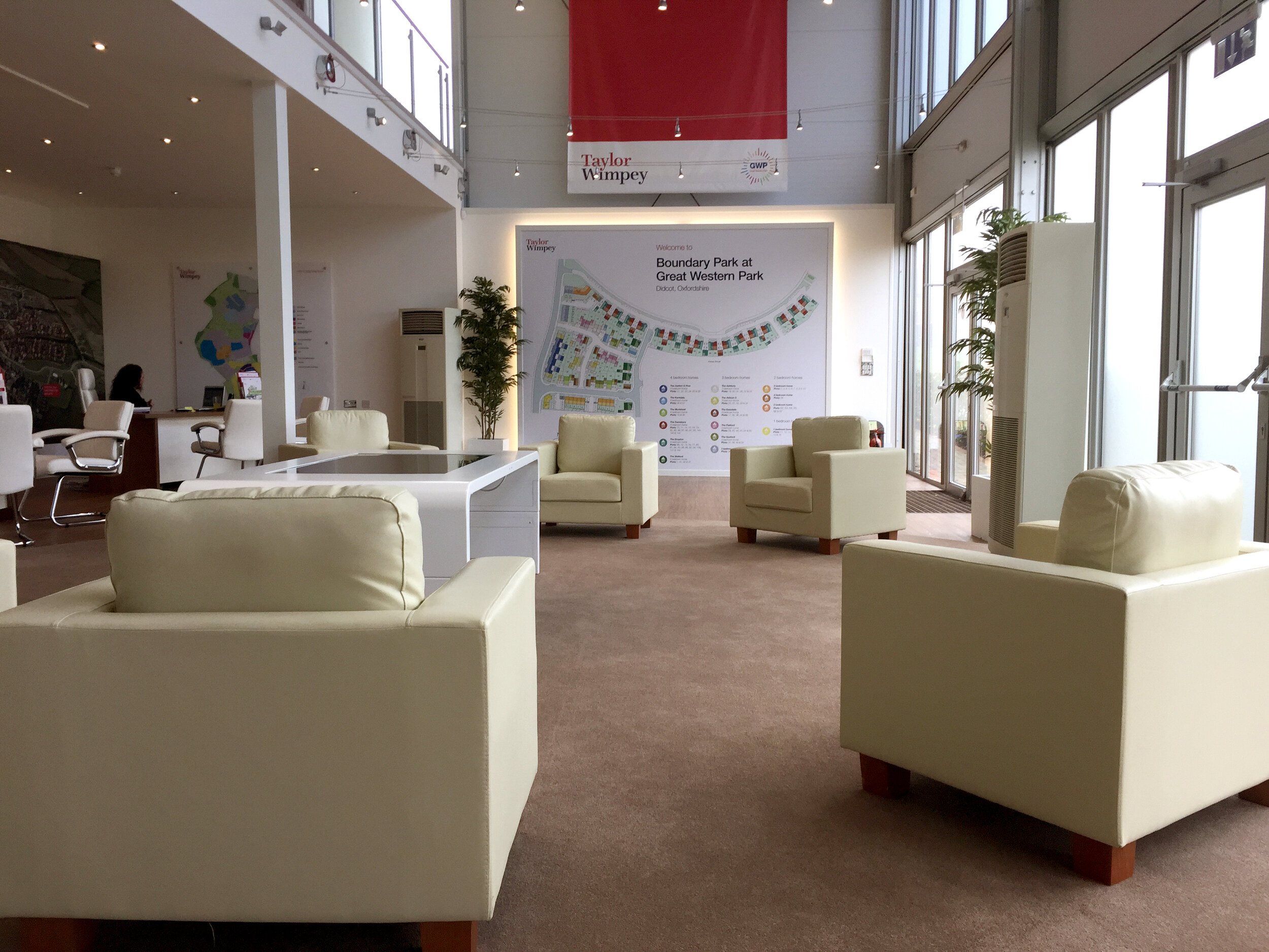
The confusion of displays have been removed and replaced by a single interactive display with a comfortable seating area. The colours throughout are more neutral tones with clear zones, subtly defined by the change in flooring. A site map display has been placed by the entrance and on entering, the visitor can clearly see the sales desks ahead of them.


